Client
Cataloga
Background
Cataloga was the first company to come from the PricewaterhouseCoopers
incubator fund. It has rapidly become one of the leading e-procurement
company in Europe and the Middle East. The company supplies e-procurement
software systems solutions to facilitate back-end procurement systems.
Project
Corporate
Identity, Exhibition, Presentation, Marketing Literature and Website
Task The extensive brief encompassed a new identity, exhibition stand
and literature and a branded e-procurement portal.
The identity was to run out across all communications and had to be able to withstand the rapid expansion of the company. In the new market space the company was keen to establish a strong presence.
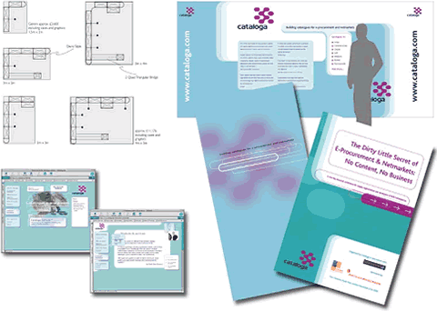
Solution
Following an evaluation of the company's identity it was clear that
the current identity was perceived as cold and dull and the capital
A used also caused mispronunciation of the name. Needing to address
a diverse audience from small family firms to huge multi-nationals the
identity would have to convey a solid business like and established
feel but with a feeling of energy and an approachability.
The blocks idea behind their existing logo was to give the impression of data being rationalised and ordered. A mark was developed which retains the notion of blocks but gives a feeling of flow and movement. The hard edged squares have been replaced with a more rounded shape giving a softer look.
To avoid the mispronunciation the name was transferred into all lower case in a font that echoes the shapes. The colour palette chosen is unusual, a deep, cool, business-like blue is used for the name style, offset with a vibrant and warm cerise for the mark. The curving shapes were then developed as a linking theme, used to give a coherent feel to all the other material including stationery, presentations and the web.